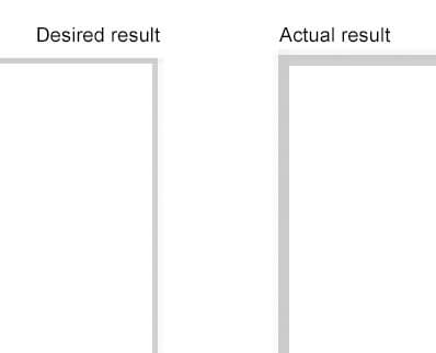
1px hairline CSS borders on HiDPI screens
Supposedly we've come to grips with CSS pixels and device pixels by now and gotten past our Pixel Identity Crisis. Retina Display Media Queries are all good and dandy, but there is something that remains tricky: CSS borders.
Imagine having a great and esteemed brand, a hotshot designer and a bunch of subtle lines in your interface. What are you going to do? Right, you'll use borders.
.my-element {
    border: 1px solid #f5f5f5;
}
That looks nice until you check your project on a device with a HiDPI screen. Even though you may professionally ignore the fact that your borders look slightly less subtle, your hotshot designer will probably be less sloppy and check it out in Photoshop. After all, you're tasked to deliver a shiny interface that pulls out all the stops for your client.

So what happened? Thanks to the way CSS pixels are treated on HiDPI screens, your border was blown up to twice its size and you're now stuck with an interesting challenge. "Is it possible to define 0.5px borders for retina screens?" you will inevitably ask. The answer is: no(t yet). It'll work only in Firefox and Safari 8 (introduced in OS X Yosemite).
There are workarounds using border-image and/or multiple background images. I have opted for a third approach: transform(scale). Below is my documented LESS mixin stack:
/** Mixin stack for hairline borders on HiDPI screens
*  [1] Sets a standard border for all devices
*  [2] Matches devices with a HiDPI screen resolution
*  [3] Creates a pseudo-element before the element that has the border
*  [4] Resets the border on the original element
*  [5] Sets the desired border on the pseudo-element
*  [6] Positions the pseudo-element absolutely
*  [7] Positions the original element relatively if is not yet positioned (set to false if
       your original element is already positioned)
*  [8] Scales the pseudo-element up to twice the size of the original element via width and height
*  [9] Scales the pseudo-element back down to the correct size via CSS Transform
        > This is where the magic happens: the border is scaled down to 0.5 CSS pixels which will render
          as 1 device pixel on HiDPI screens
*/

.border-hidpi-base(@positionRelative) {
    @media (@hidpi) {                            // [2]
        .position-relative(@positionRelative);   // [7]

        &:before {                               // [3]
            .transform(scale(0.5));              // [9]
            .transform-origin(0 0);

            content: "";
            position: absolute;                  // [6]
            top: 0;
            left: 0;
            width: 200%;                         // [8]
            height: 200%;
        }
    }
}

.border-hidpi(@side, @color, @positionRelative: true) when (@side = all) {
    .border-hidpi-base(@positionRelative);

    border: 1px solid @color;                    // [1]

    @media (@hidpi) {
        border-width: 0;                         // [4]

        &:before {
            border: 1px solid @color;            // [5]
        }
    }
}

.border-hidpi(@side, @color, @positionRelative: true) when (@side = top) {
    .border-hidpi-base(@positionRelative);

    border-top: 1px solid @color;

    @media (@hidpi) {
        border-top-width: 0;

        &:before {
            border-top: 1px solid @color;
        }
    }
}

.border-hidpi(@side, @color, @positionRelative: true) when (@side = right) {
    .border-hidpi-base(@positionRelative);

    border-right: 1px solid @color;

    @media (@hidpi) {
        border-right-width: 0;

        &:before {
            border-right: 1px solid @color;
        }
    }
}

.border-hidpi(@side, @color, @positionRelative: true) when (@side = bottom) {
    .border-hidpi-base(@positionRelative);

    border-bottom: 1px solid @color;

    @media (@hidpi) {
        border-bottom-width: 0;

        &:before {
            border-bottom: 1px solid @color;
        }
    }
}

.border-hidpi(@side, @color, @positionRelative: true) when (@side = left) {
    .border-hidpi-base(@positionRelative);

    border-left: 1px solid @color;

    @media (@hidpi) {
        border-left-width: 0;

        &:before {
            border-left: 1px solid @color;
        }
    }
}

/** Helper mixin in case you need to reset the border */
.border-hidpi-reset() {
    border-width: 0;

    @media (@hidpi) {
        &:before {
            display: none;
        }
    }
}

/** Helper mixin for relative positioning if variable is set when invoking the caller mixin */
.position-relative(@positionRelative) when (@positionRelative = true) {
    position: relative;
}
The "magic" part is that transform scales down the element after the 1px CSS border has been calculated (and no matter how much you blow up your width and height, the border is still 1px wide).
You can check out a demo here: http://codepen.io/polarbirke/pen/dlyvF
So far, I've used this technique with great success. Try it out if you like (and make your designer happy)!